HOSPITALITY / BRAND IDENTITY
The Clarke
Hotel.
Modern luxury, reintroduced.
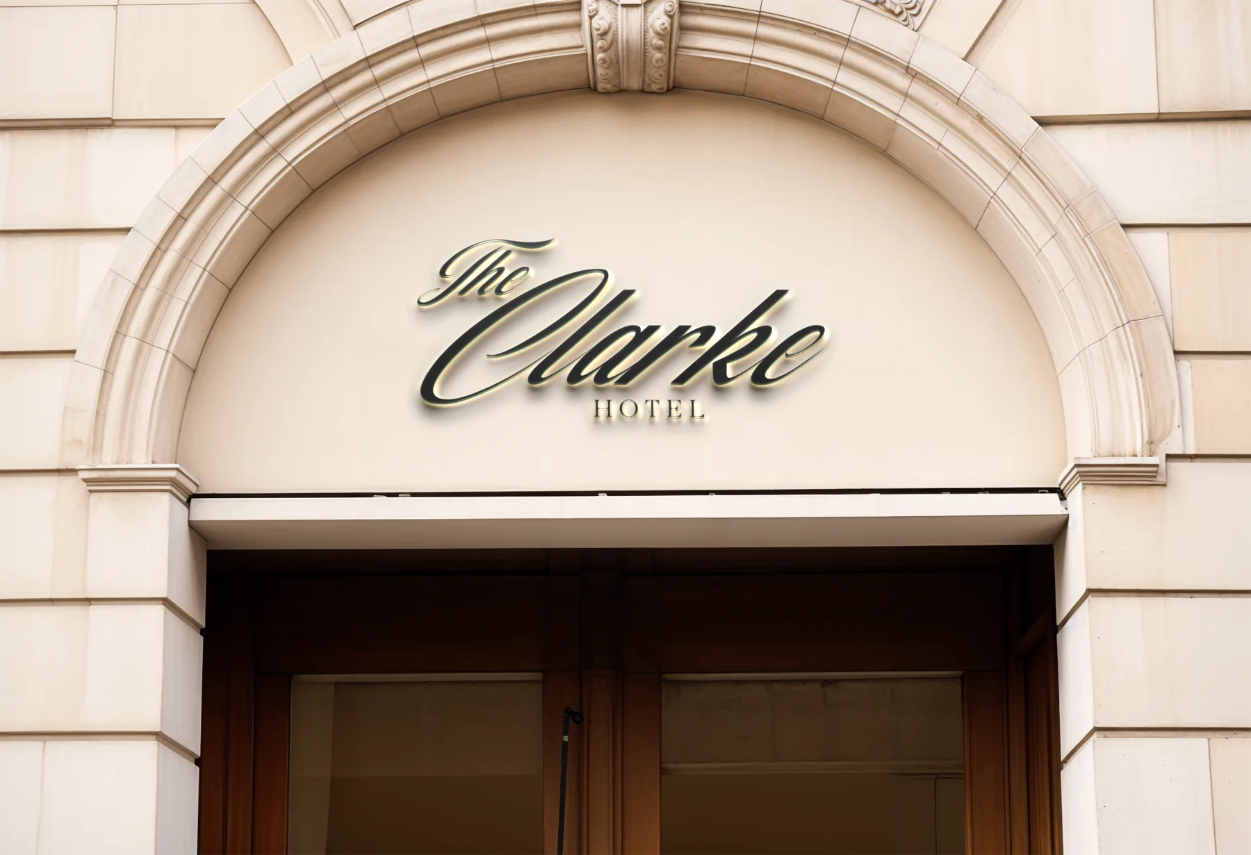
A proposed identity refresh for a Washington, D.C. hotel in renovation—designed to preserve its sense of luxury while giving its marketing and guest experience a more contemporary point of view.
- Role
- Creative Director & Lead Designer
- Scope
- Logo, brand identity kit & collateral
- Status
- Concept
THE CONTEXT
Luxury with a current point of view.
The Clarke was an established Washington, D.C. hotel entering renovation. The brief was not to start over, but to create a more current visual system that could still feel composed, warm and enduring.
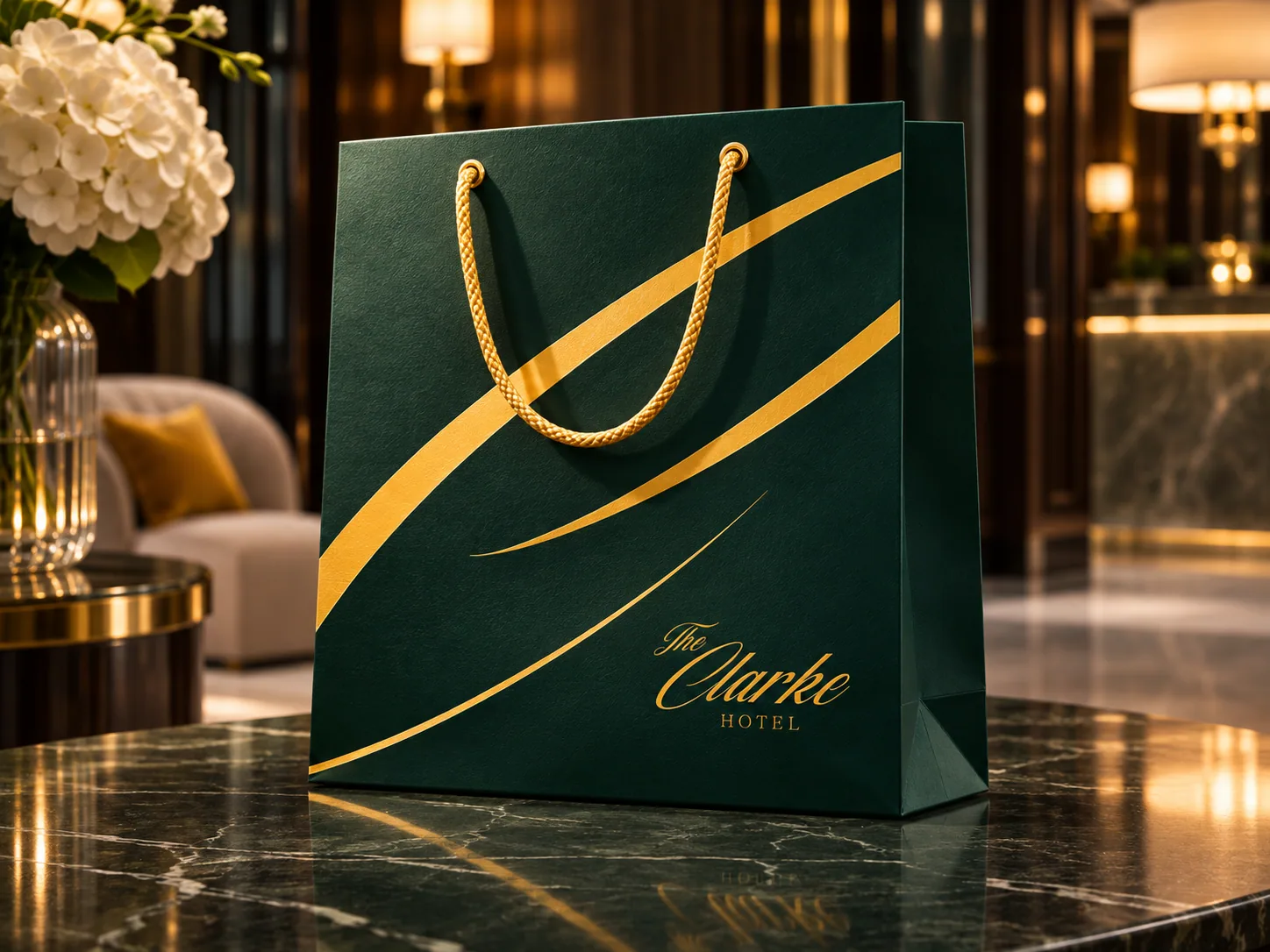
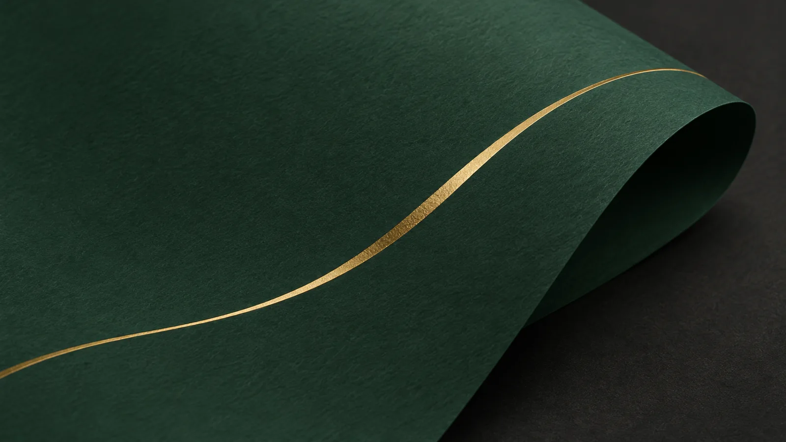
The resulting direction pairs a deep evergreen base with restrained gold accents, a formal signature mark and hospitality details intended to feel considered at every scale.
THE IDENTITY
A signature system for hospitality.
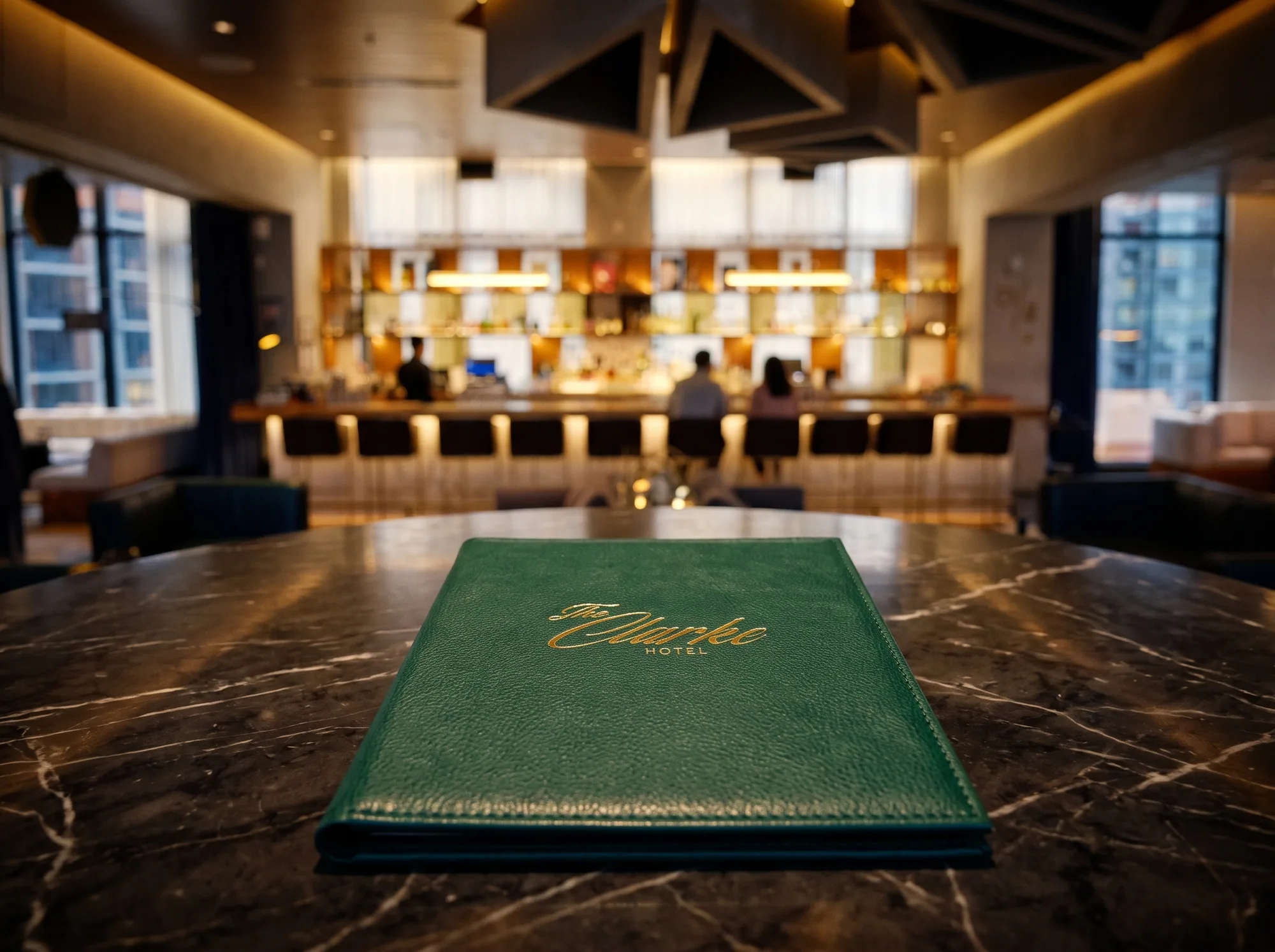
The identity was designed to be recognizable before a guest reads a line of copy: the scripted wordmark supplies the ceremony, while gold curves and evergreen fields give the system a distinct, flexible rhythm.
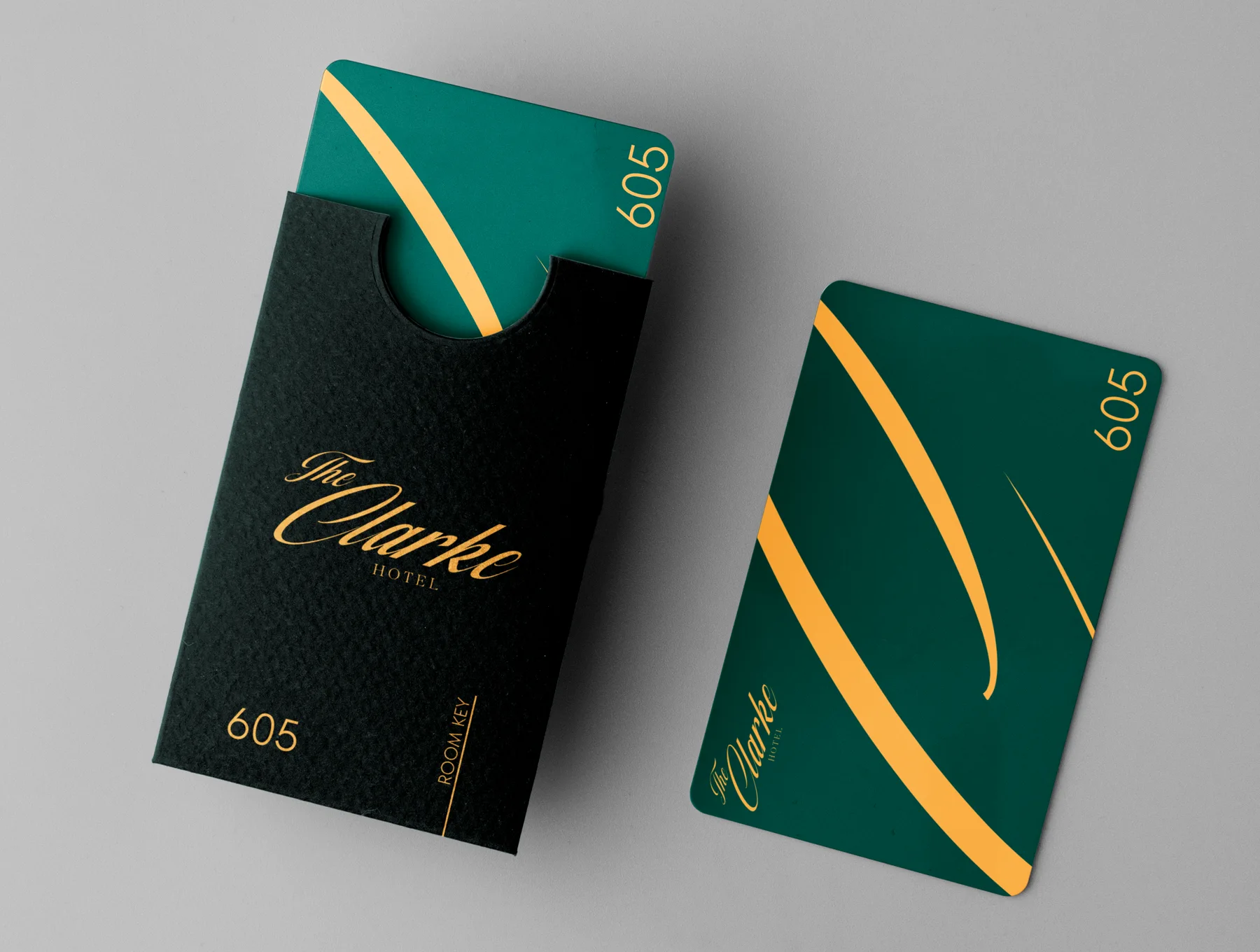
The aim was a language that could move from a formal entrance to a room key or dining menu without losing its character.
GUEST TOUCHPOINTS
Make the stay feel considered.
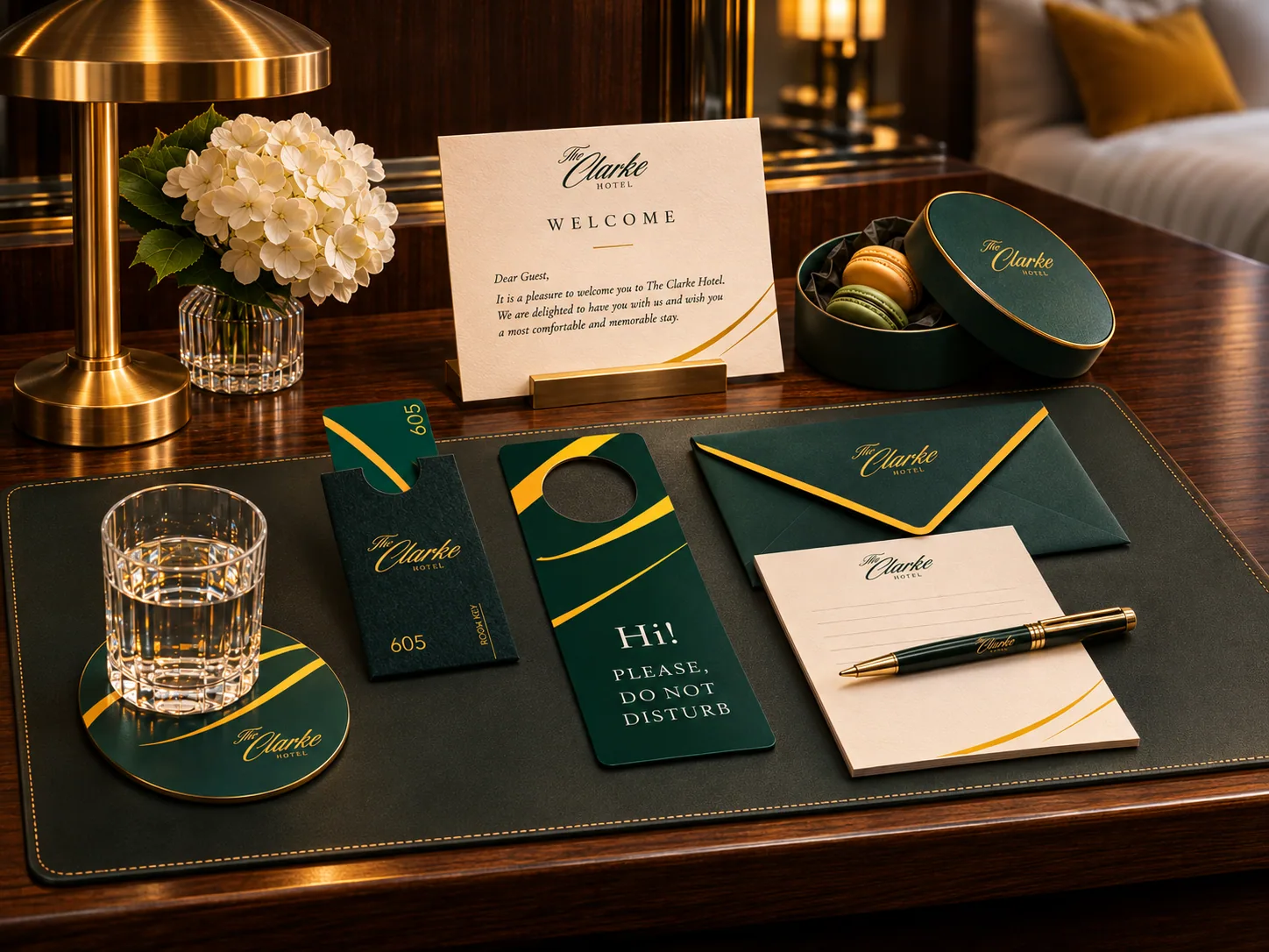
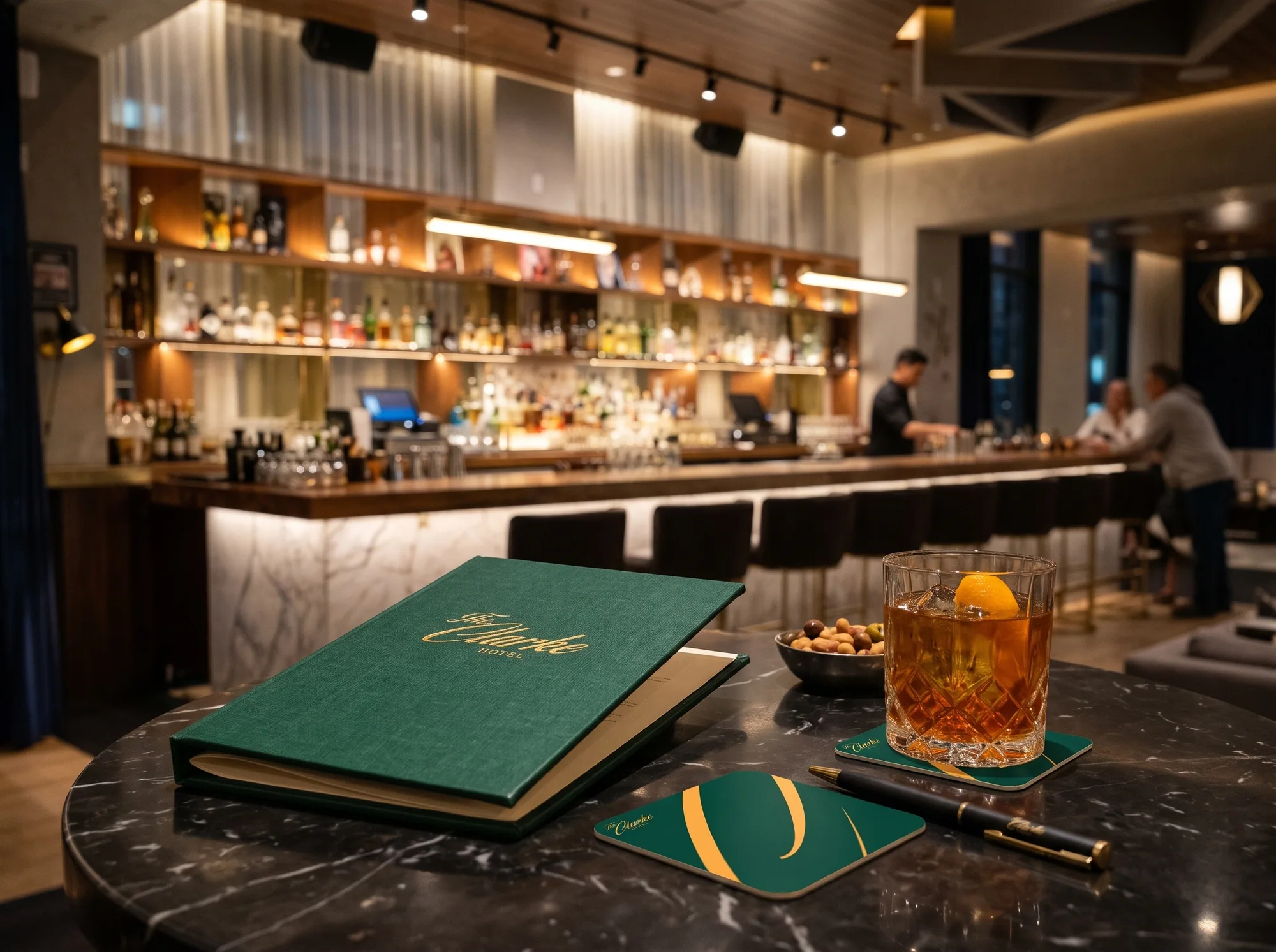
The proposed collateral system treated arrival, in-room service and small moments of hospitality as one connected experience. Each item gives the brand a practical role rather than turning it into decoration.
SERVICE PRESENCE
Extend the identity into service.
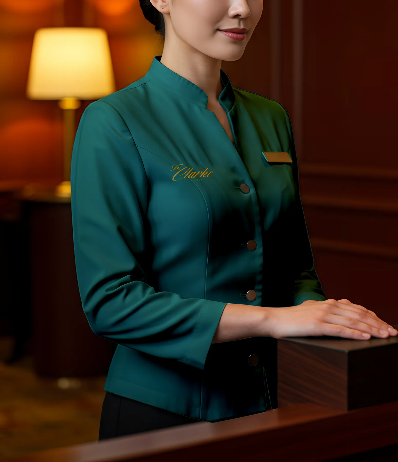
A hospitality identity has to work in motion. The uniform concept translates the palette and signature into a staff-facing application meant to feel polished and legible, not costume-like.
DIGITAL DIRECTION
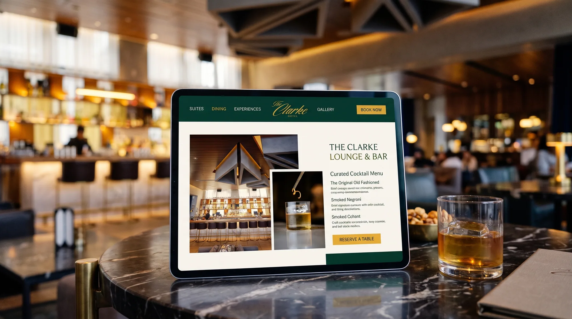
Translate atmosphere into screen.
I brought the identity into a calmer, image-led website direction for suites, dining and experiences. It was part of the proposal.
SOCIAL MEDIA CONCEPTS
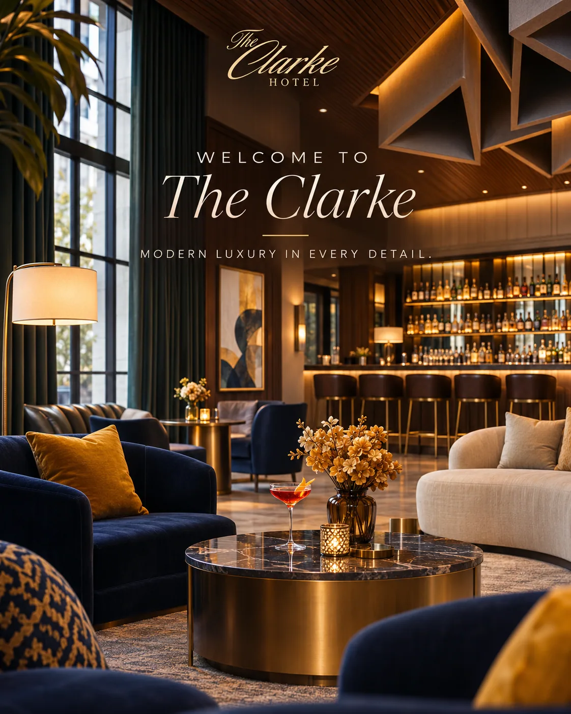
The identity in the feed.
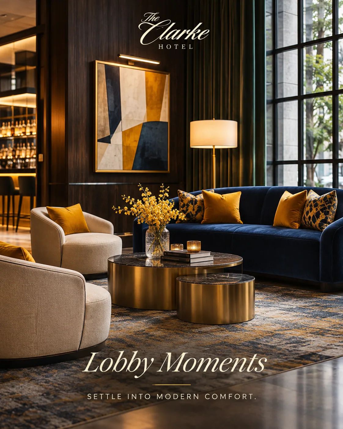
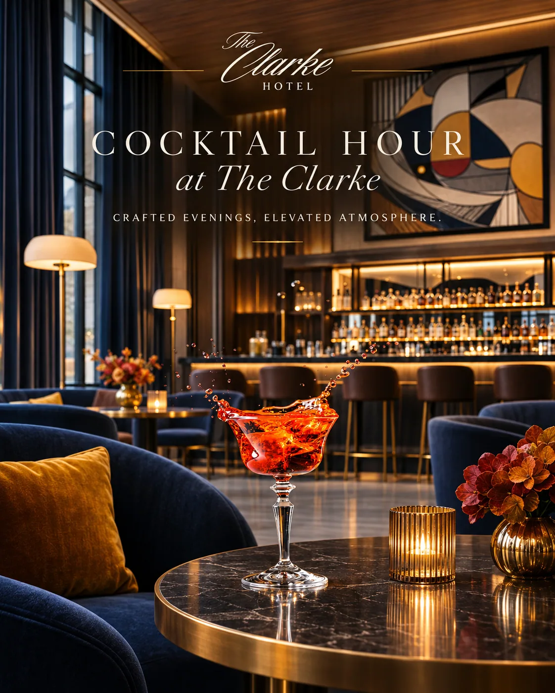
A set of portrait posts brings the same evergreen, gold and editorial tone to hotel storytelling. These are illustrative social concepts from the presentation, not published campaign results.
STATUS
Concept.
I designed an identity proposal for The Clarke Hotel: a logo direction, a visual system and collateral concepts. The hotel did not launch this rebrand.
MORE WORK