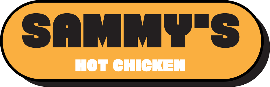
Sammy's Hot Chicken
A bold neighborhood chicken identity, built to move from the menu board to the takeaway bag.
Explore the identity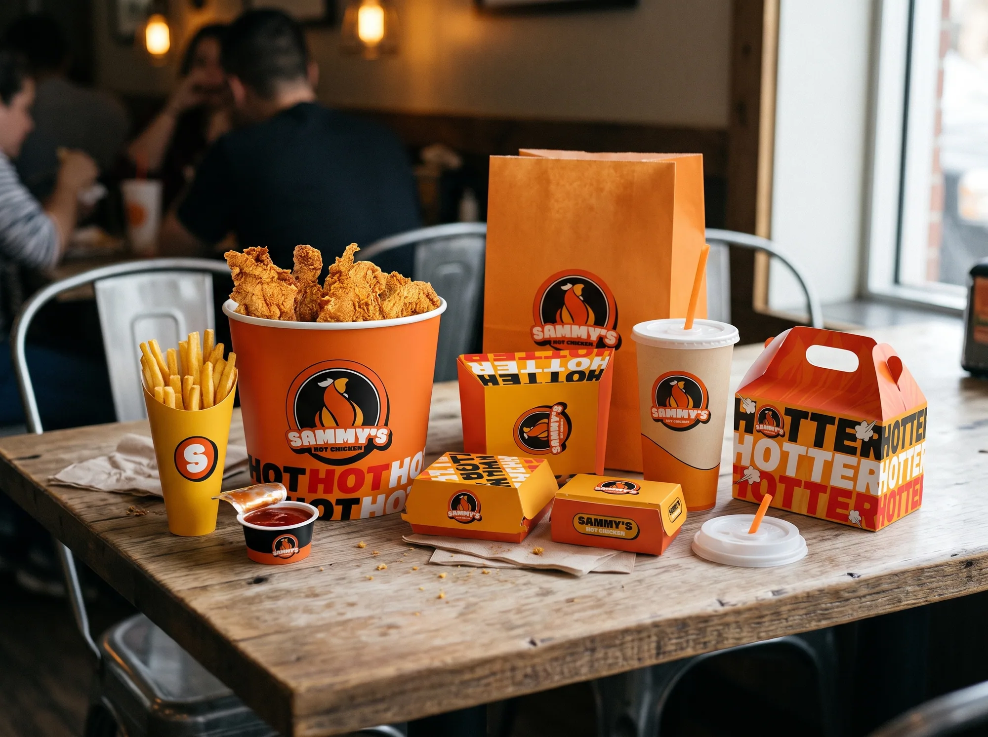
Project focusIdentity, promotional graphics and packaging
Project teamSammy's Hot Chicken client team
EngagementCompleted concept
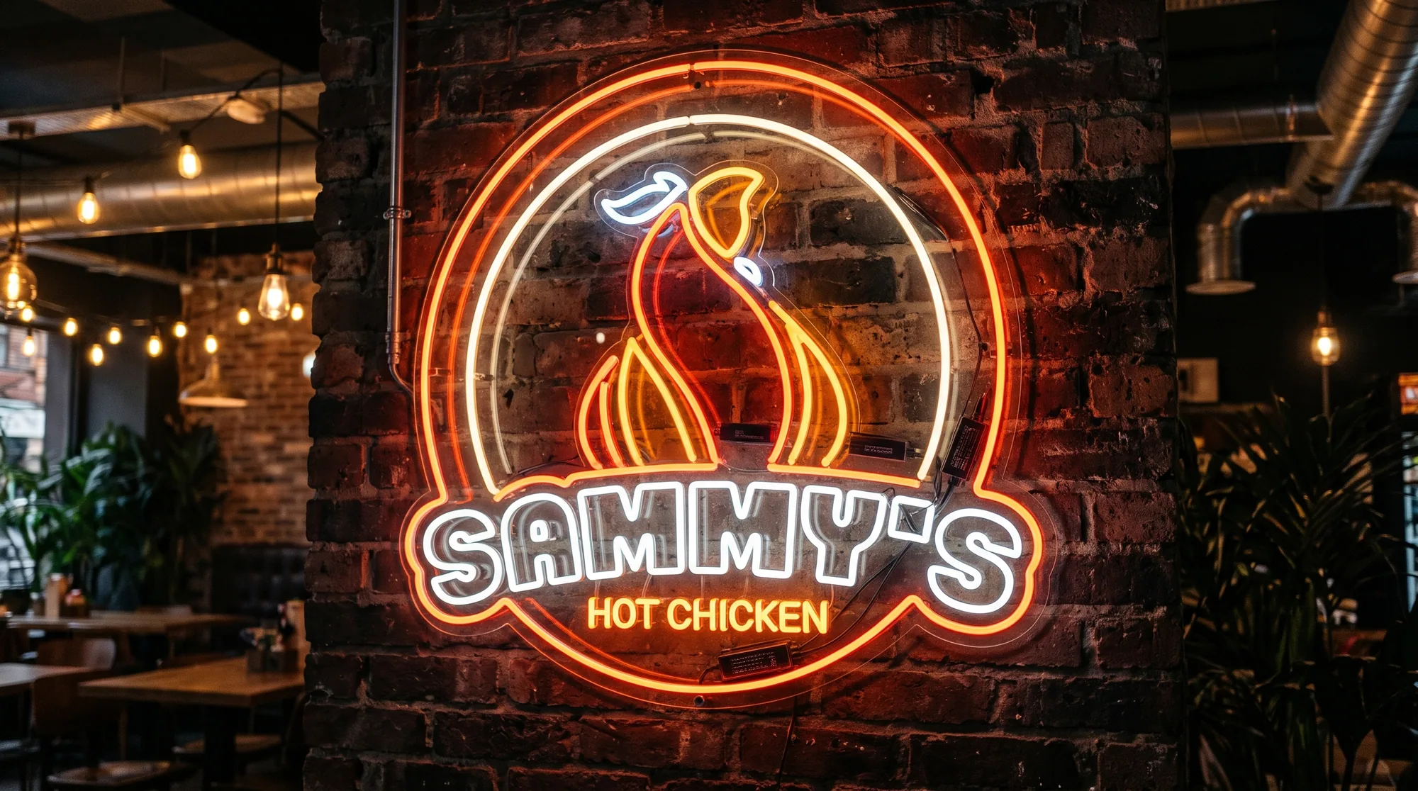
Familiar food cues.
A louder personality.
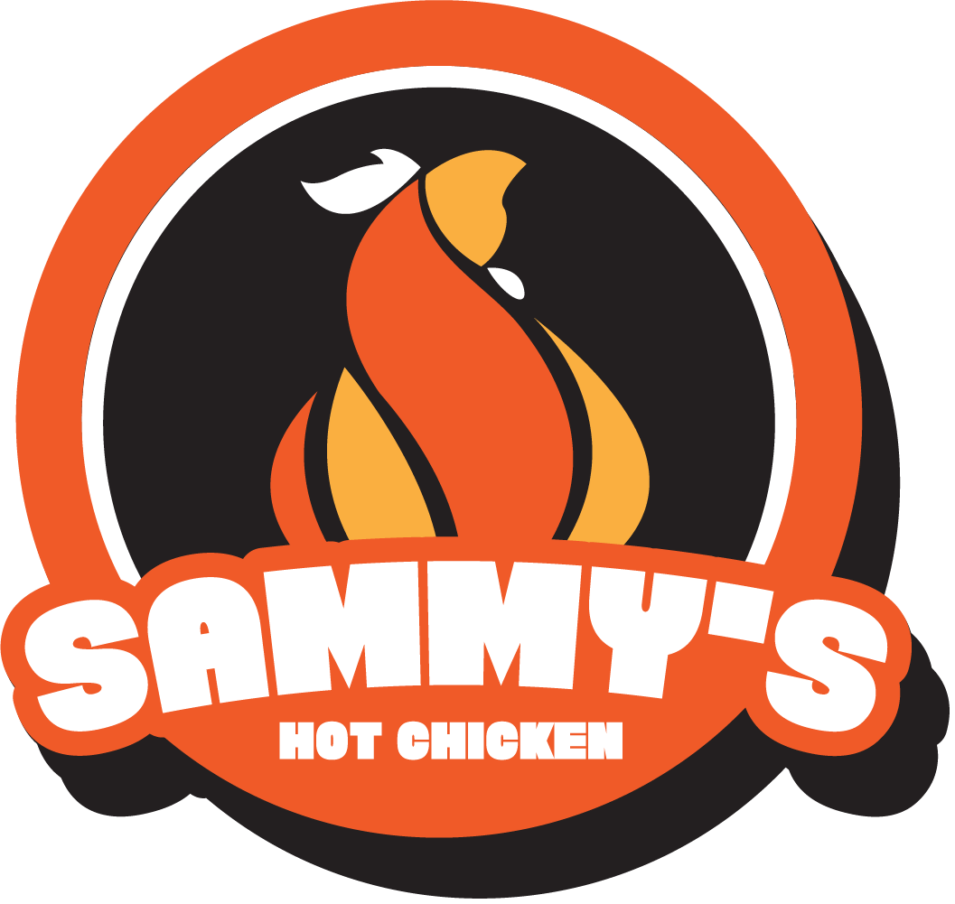
The identity pairs a memorable chicken mark with high-contrast type and a direct, high-energy palette—designed to carry from a first impression to packaging in hand.
Familiar food cues.
A louder personality.
One Mark.
Room to Play.
The identity artboard puts the chicken badge at the center. I pushed the promotional art further through scale, repetition and the same direct palette.
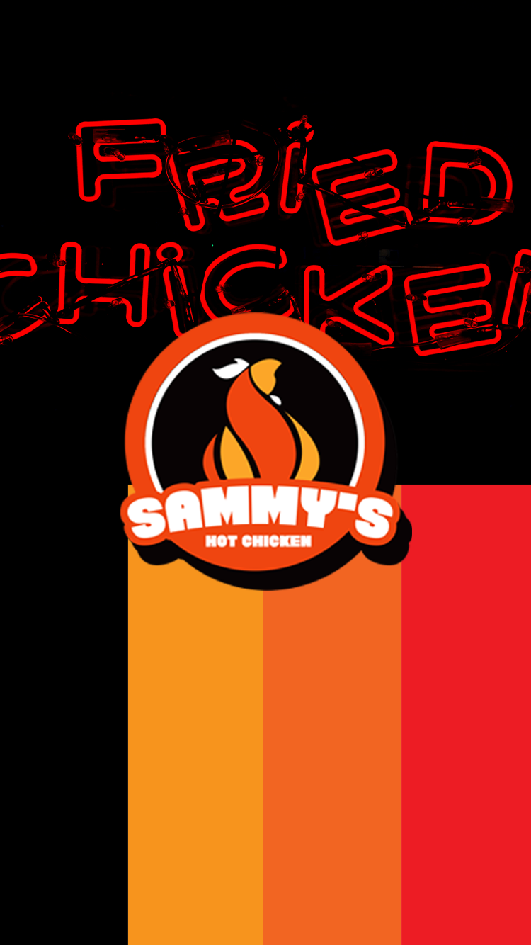
Four Colors Do the Work.
Palette values are sampled from the supplied promotional artboard. The source artboards do not specify the display typeface.
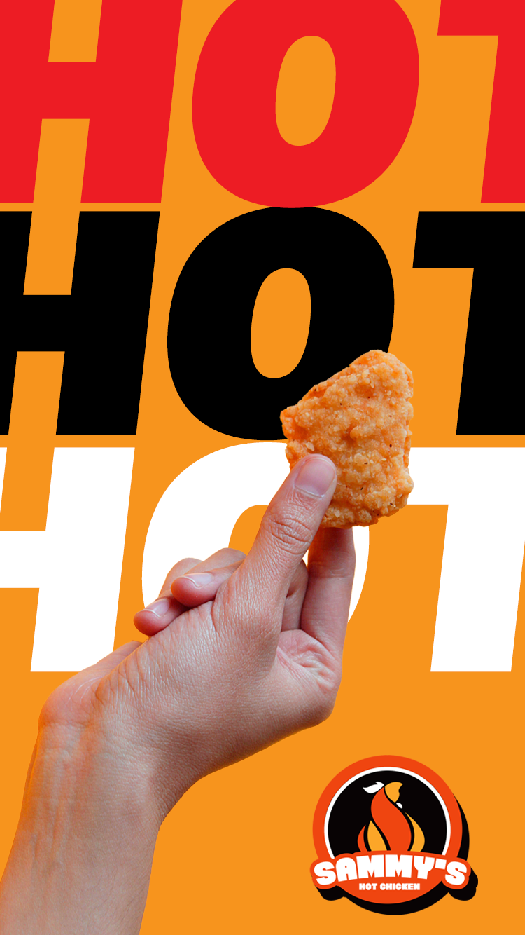
Type That Does the Shouting.
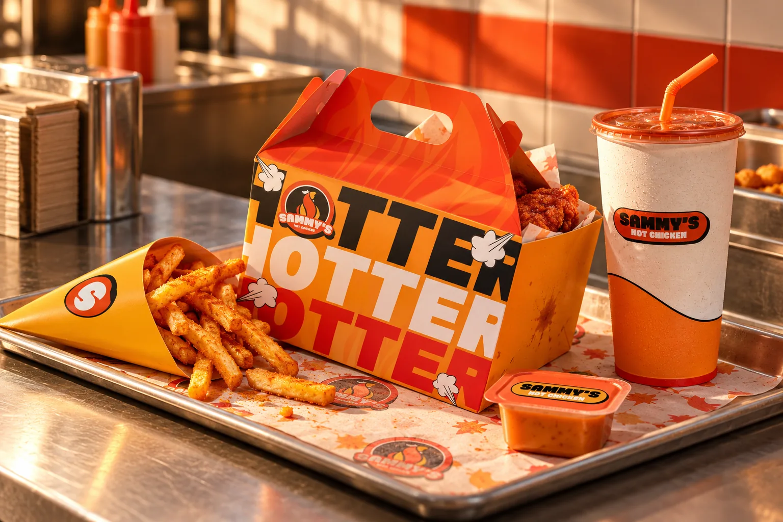
Oversized, tightly packed display lettering turns a simple word into the main graphic.
From Graphic to Object.
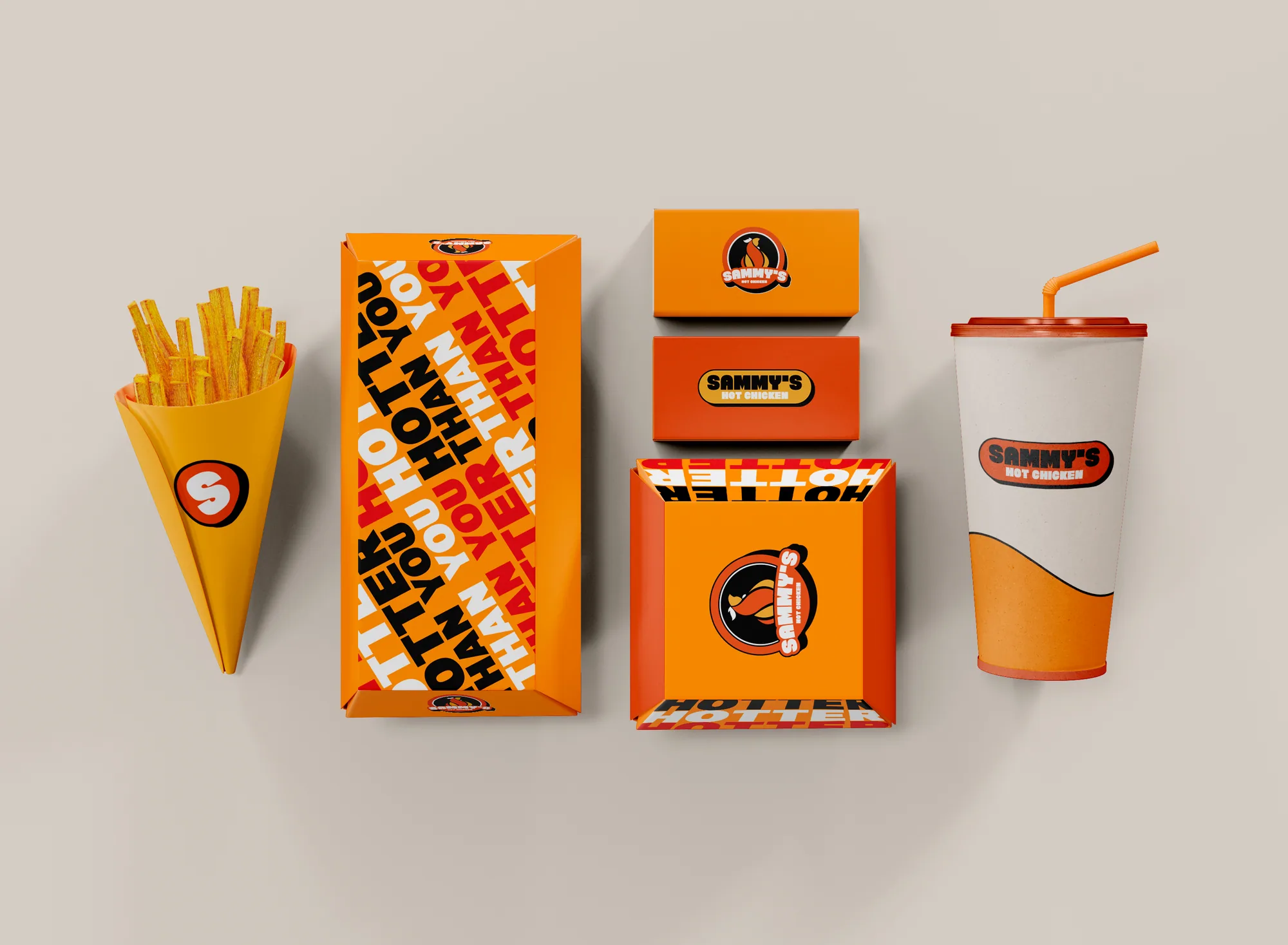
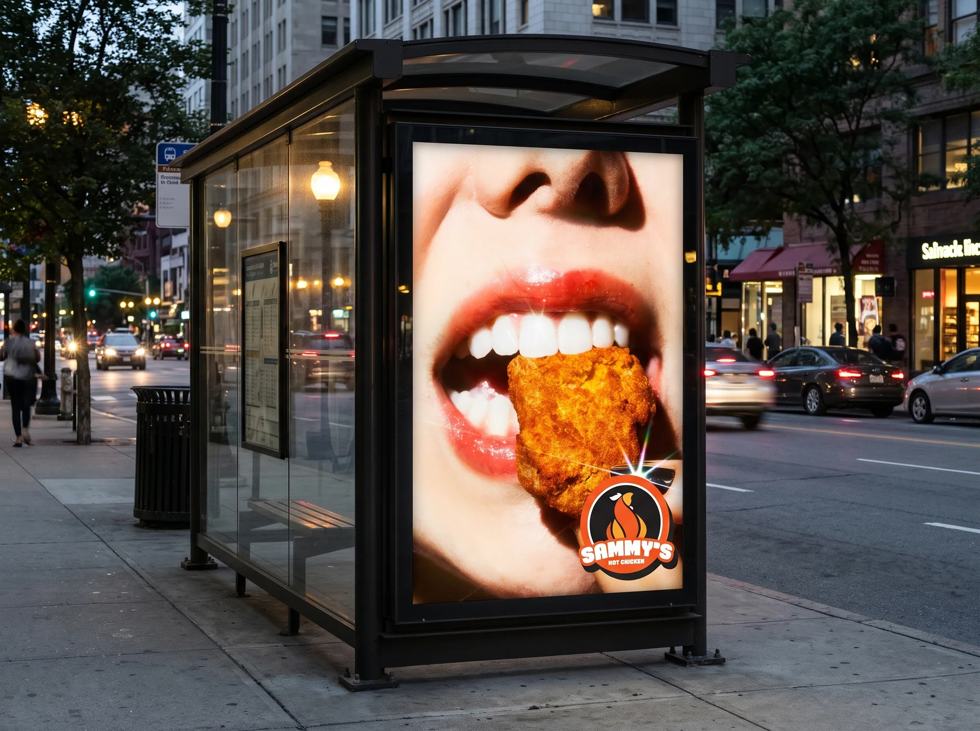
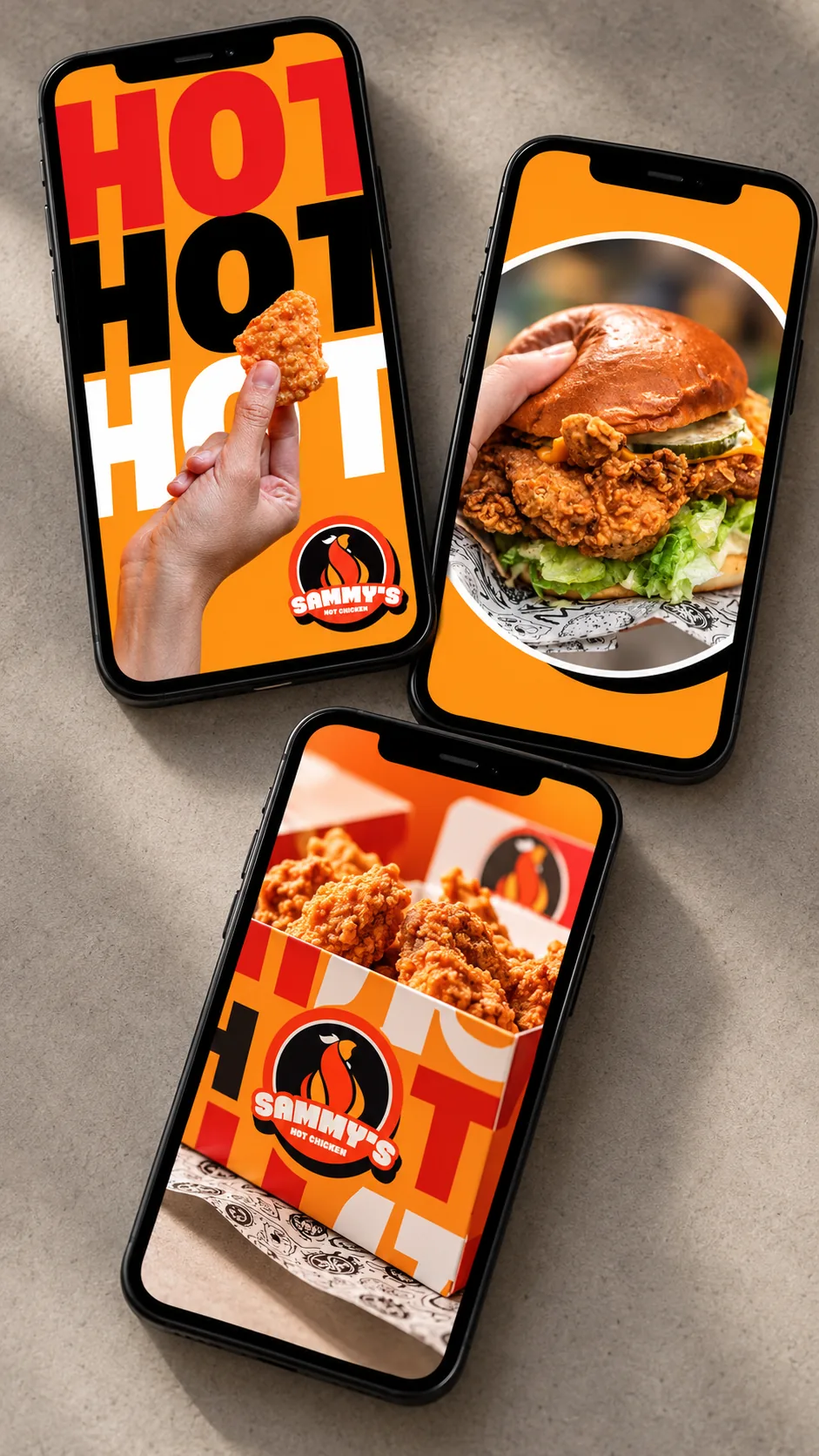
The packaging studies carry the mark and lettering onto boxes, cups, and smaller touchpoints. These are design concepts and illustrative applications.
The same attitude,
at every scale.
A Look Beyond the Artboard.
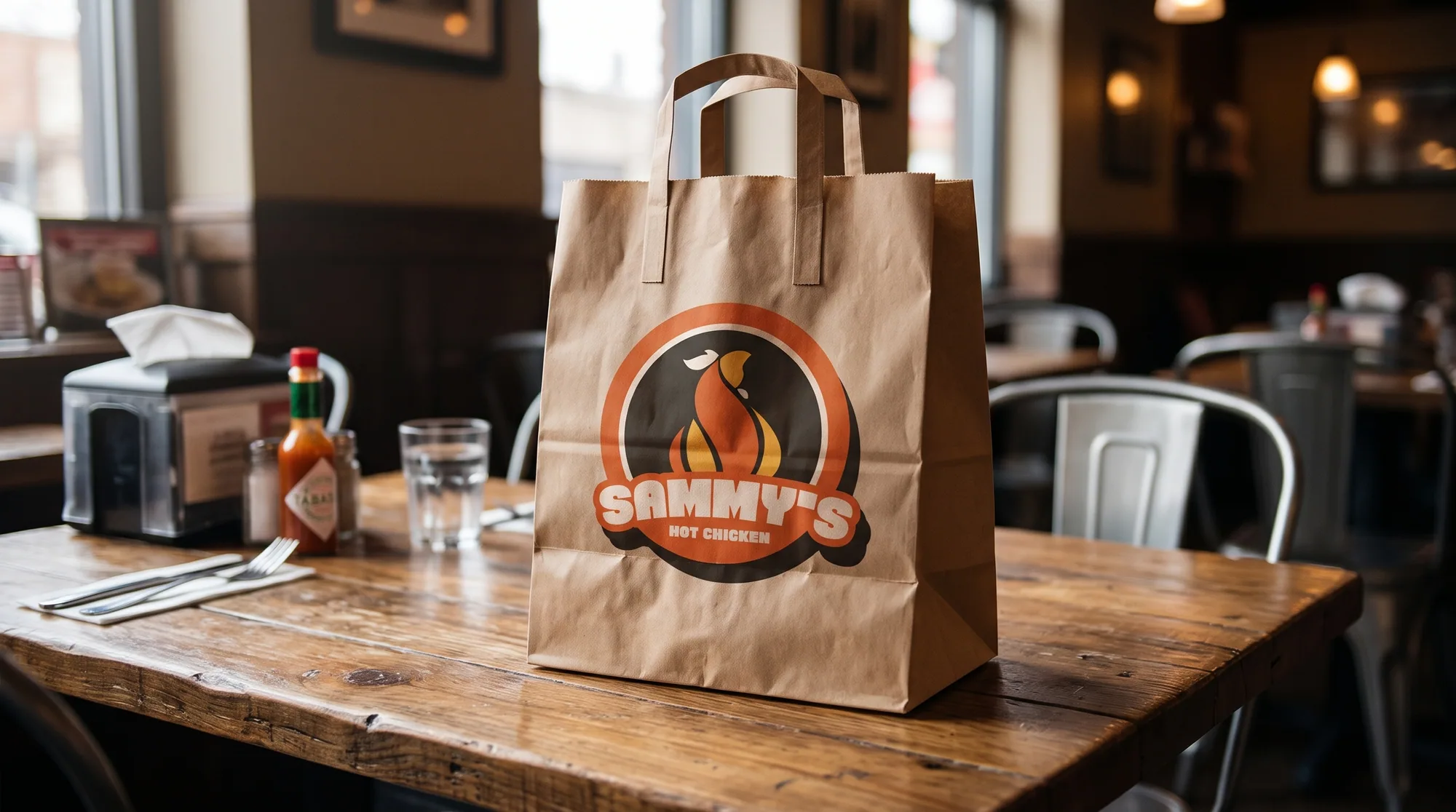
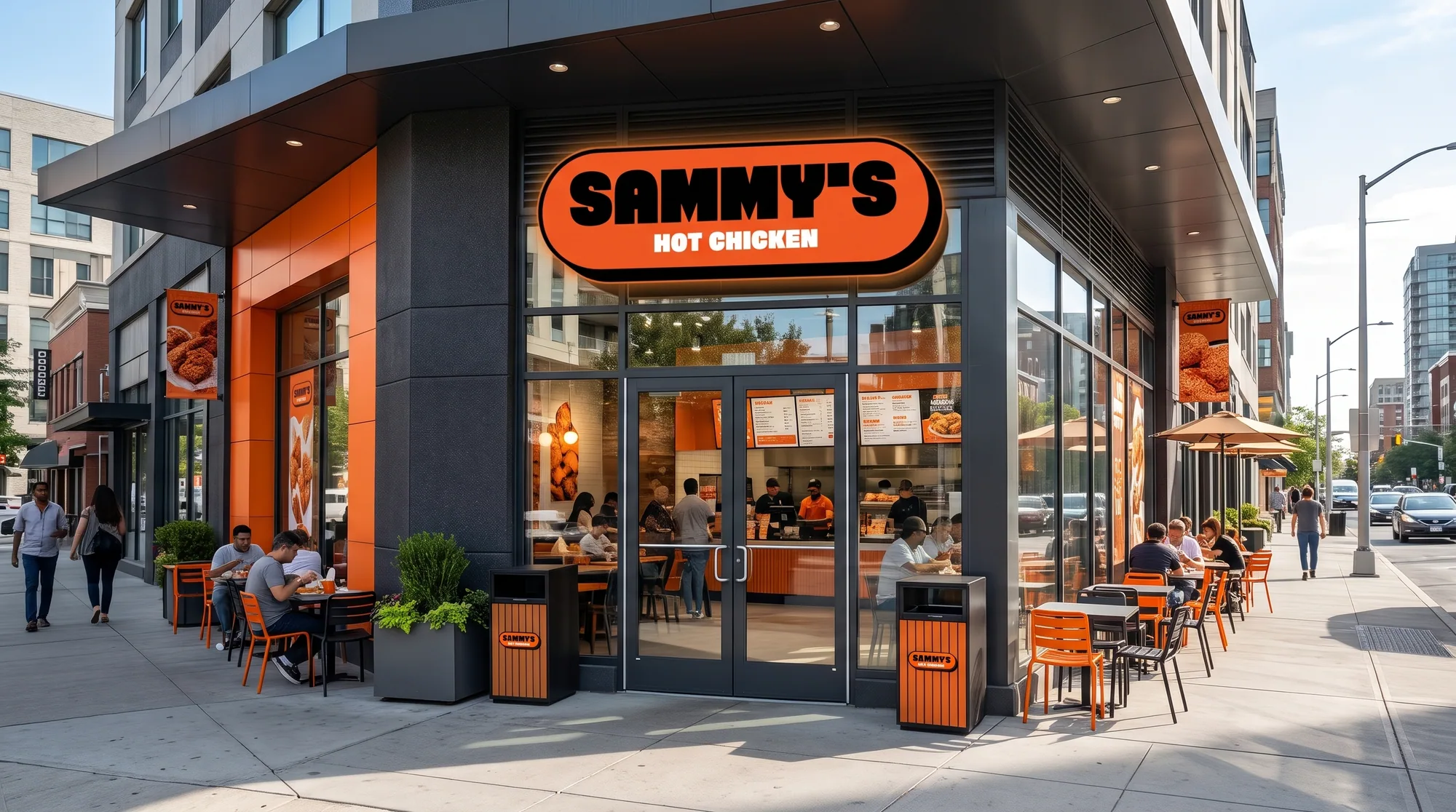
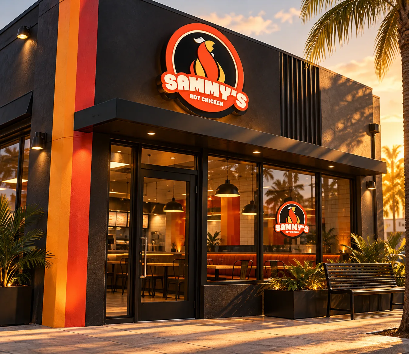
These portfolio mockups show possible applications. They do not document a real storefront, published campaign, or produced packaging.
Concept.
I designed a hot chicken identity and carried it through the badge, promotional graphics and packaging studies.
What I Designed
- A logo direction, promotional graphics and packaging studies for a local hot chicken shop.
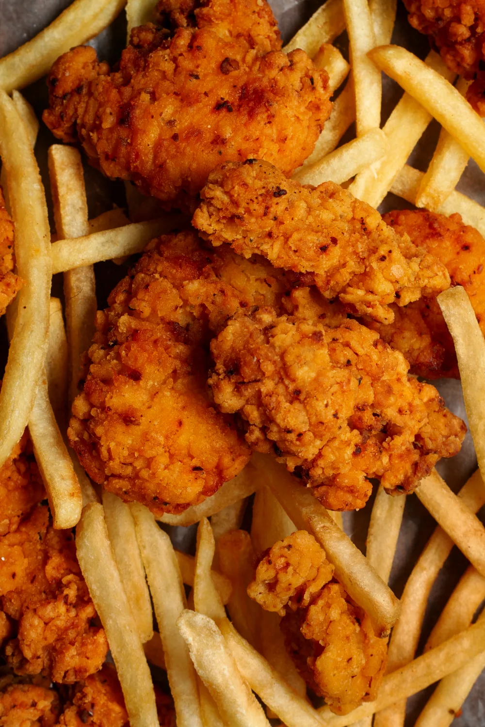
- The identity artboards, food visual and collateral concepts on this page.
- Website, chatbot and order-intake ideas stayed in the brief. This case shows the identity.